Research + Strategy
DigitalOcean Product Taxonomy
Mitigating product naming collision and reducing user confusion about what we offer.
Role: I led research, synthesis, and socializing of findings. I collaborated with two other designers who were on active workstreams impacted by the problem.
Opportunity
Teams would reach similar conclusions when naming or describing their products and features. This resulted in users conflating our offerings or not knowing they exist.
We have an ecosystem of first and third-party solutions, but our product taxonomy began to fracture as we expanded. This impacted the discoverability of our offerings across touchpoints. Users interact with various DigitalOcean properties and inconsistent or duplicative naming across marketing, product, and API experiences exacerbates confusion.
For example, seemingly neutral terms like “add-ons” or “apps” were problematic because teams claimed them as branded terms for their products. We needed to reorient ourselves around how users think about our offerings and course-correct.
-

Mixed messaging across touchpoints
User research
I conducted two research efforts to understand customer mental models and categorization for first and third-party solutions.
Through extensive card sorting exercises and IA tests with users, I identified key mental models that impacted how users think about our solutions. Prevalent criteria that impacted their categorization and ability to discover an offering included:
How much work do I do to set it up and maintain it?
Is it DigitalOcean "flavored”?
Is it inside of the stack?
Does it address a critical need?
How much of my problem does it solve?
Does it create a cloud resource?
Is it a standalone system or dependent on something?
-

Hybrid card sort
I facilitated 1:1 interviews with over 20 users to understand their interpretation of key terms and allowed them to recategorize items based on their line of thinking.
-

IA task analysis
The current control panel IA and a proposed IA were tested to understand where users expect to find and manage specific offerings.
Key findings
We’re on the wrong path
As hypothesized, our taxonomy doesn’t accurately represent how users think about what we offer. Branded layers create unnecessary abstractions and mismatched expectations around what our offerings do.
Too many interpretations
“Add-on” had many interpretations making it risky as a navigation label, a descriptor for DigitalOcean products, and a name for Marketplace SaaS. Marketplace 1-Click Apps, Marketplace SaaS add-ons, authorized third-party applications, and App Platform (our managed hosting product) were also conflated.
Safe from misinterpretation
“Product” and “solution” were commonly used to define first-party offerings.
Marketplace is a silo
The current control panel navigation impedes discovery since Marketplace exists in a silo and products lack cross-awareness. Users expect to discover and manage these tools in the context of a project or specific cloud resources.
“There are components related to your account like Snyk and Datadog. I don’t put ingress in the same category.”
— Droplets and Marketplace SaaS user
“Those 1-Click Apps should really be managed if it’s one click. I didn’t know that.”
— Kubernetes user
Outcome
Insights helped carve a path forward for product teams.
We embarked on an epic journey of change management and ran experiments before pushing changes live to ensure metrics weren’t impacted negatively. Moving forward, naming studies for new offerings were done in context of our whole ecosystem vs. only within the product’s vertical.
-
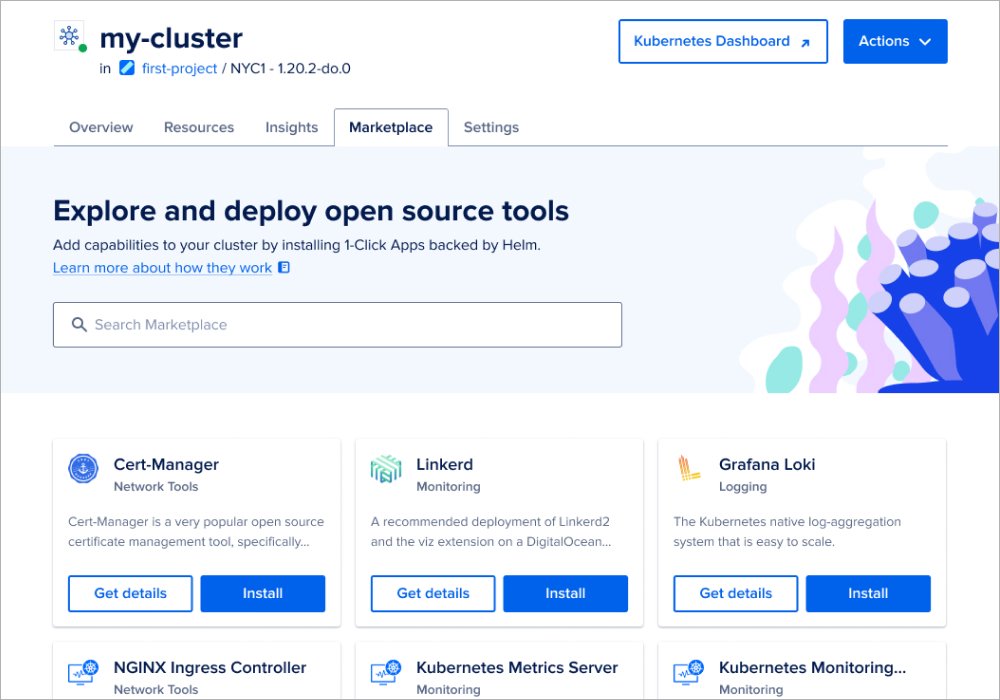
Kubernetes Marketplace
“Add-on” was eliminated to describe Kubernetes open-source tools. I designed a Kubernetes Marketplace Helm chart experience since users expected to discover and manage them in a cluster.
-
Product reframing
“Add-on” was eliminated to describe DigitalOcean products so naming conflicts no longer persisted with Marketplace offerings. 1-Click Apps pages were also updated to represent functionality accurately.
-

IA navigation clarity
“Apps” was no longer used to reference App Platform in our navigation. Our IA was adjusted to include the product’s full name. Our block and object storage products were changed to include their functionality in the IA too.
Key results
We embraced a new era of “calling it what it is” to eliminate confusion around our offerings.
Some changes positively impacted metrics. For example, users were 32% more likely to be retained if they installed a Marketplace Helm chart.
We observed an increase in control panel visits to product sections that received a navigation label change.
Continued improvements
Change management at scale is… well, challenging.
Some touchpoints were easier to change than others. It’s harder to make updates to the API so some inconsistencies persist. It’s also difficult to completely rename products after they launch. However, by evaluating our IA and how we describe these offerings we proved impact was still possible. Teams started to better integrate Marketplace offerings in their product and I kicked off a project on how we can add clarity to what users can create with App Platform. The Marketplace team also prioritized a redesign of their catalog so they can more effectively categorize and filter their tooling.
If you are interested in learning more about this work, reach out, and let’s chat.